An Overview of U.S. Forest Service Tree Density Data
If you’re an outdoorsy person and could benefit from maps that show you the detailed distribution of hundreds of species of trees across the US, then stop what you’re doing and pay attention to this post. I’m not trying to be dramatic, it’s just that the data sources discussed in this post could have a substantial impact on the way you engage with your local woods. So if that’s you, grab your drink of choice, settle in, and bring your curiosity.

With that notice out of the way, here’s what we’ll the covering in this post: the Tree Species Metrics and Individual Tree Species Parameter Maps provided by the U.S. Forest Service. My goal is to have this post serve as a high-level overview of each dataset, so don’t be surprised if later posts explore these in more detail.
What Exactly Do These Datasets Do?
While these datasets have been public for many years, I think very few in the general public have ever heard of them. Heck, I highly doubt most people would believe that the function these datasets provide is even possible.
So what do they do? These datasets provide maps that estimate the approximate density for a species of tree across the continental United States. For example, if you’re looking for groves of oak trees in the forests around you, you could pull up the ‘northern red oak’ layer (or some other species of oak tree), and it would show you the approximate distribution of that tree.
The primary function of both datasets is to offer maps that show the approximate density of a species of tree (or a group of species). Both datasets cover the continental United States and there are several hundred tree species present in each. The data is presented as a raster map, which means that it’s a grid of pixels where each pixel has a value associated with it. If you’re unfamiliar with raster data, you can think of it like a weather map that depicts the levels of rainfall over a region.

So the maps help you approximate the density of a species of tree in your local area. The data presented on the maps has a unit of trees per acre, and there are two separate metrics used by the U.S. Forest Service. The two metrics are:
- Stand Density Index
- Basal Area
While these two metrics are not the same, they are quite similar and for the average person you can mostly ignore the distinction. Here’s how the wikipedia entry for Stand Density Index describes the relationship:
Stand density index is usually well correlated with stand volume and growth, and several variable-density yield tables have been created using it. Basal area, however, is usually satisfactory as a measure of stand density index and because it is easier to calculate it is usually preferred over SDI.
So just know that these metrics are working to measure the approximate density of a tree in an area, and so a higher value generally means more trees. If you’re a layperson like me that looking to use this data for non-technical purposes, then you probably should not worry about the difference.
How Did They Get This Data?
So how on earth is the USFS able to provide this kind of data? Clearly they don’t have the budget to send their staff out to measure every woodlot on the continental United States.
There are many tools they’ve used to build these datasets, but the most important tool is without a doubt satellite imagery. You might not be aware of it, but there is a measurement called the Normalized Difference Vegetation Index. Here’s the gist of it: the scientific community uses NDVI to measure the approximate amount of photosynthesis occurring in a satellite image.
So if we took satellite photos of a woodlot every week for an entire year, we could use those photos to analyze the NDVI trends, as different species have different photosynthesis patterns over the seasons.
From what I’ve been able to gather, the USFS did use a bunch of other metrics (like soil patterns, water availability, etc.) to produce these datasets, but they’re frankly over my head.
The next part of this post will cover the Tree Species Metrics dataset, and I’ll cover the other dataset afterwards. There are enough differences between the two where I figured it would be less confusing to cover one at a time.
The Tree Species Metrics Dataset
Here’s the main page you’ll want to bookmark if you’re interested in using this dataset.

Yeah, I know. It’s not the prettiest website in the world. But bear with me, as this dataset is well worth the pain of reading that wall of links. You might notice this right away: in the middle of each link is the common name of the tree species, and it also includes the metric that map represents (i.e. Stand Density Index or Basal Area). You’ll also see that each link ends in 2002, but more on that later.
What This Dataset Offers
So this dataset has the stand density index and basal area maps for hundreds of species of trees. It also covers groups of species, which are represented by links that include the text of _spp. For example, the layer that has a middle part of ‘oak_spp’ covers multiple species of trees in the oak genus.
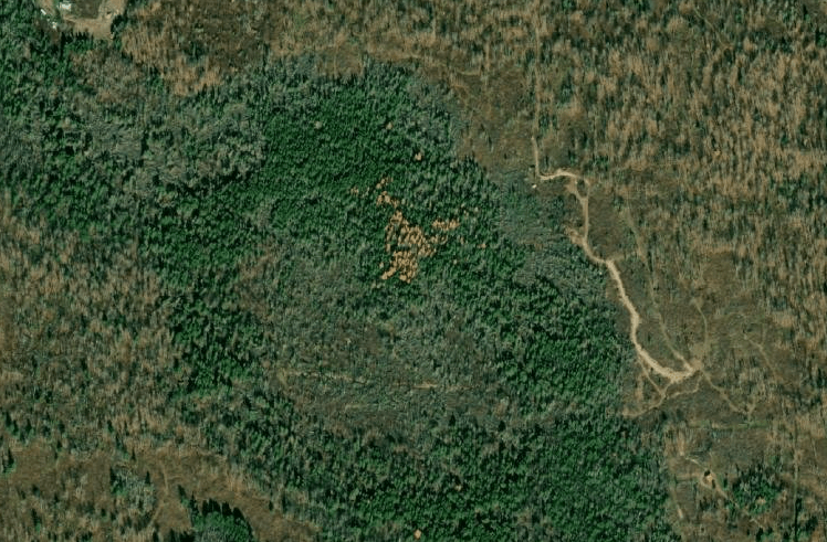
Here’s the best part about this dataset: it’s really, really granular. When you load up a map and zoom in, you’ll see that each pixel of data on the map represents a 30-meter square area of land. This means that you can get some really precise maps when you’re dealing with a tree species that is relatively common to an area.
But with all things in life, there is a catch with this dataset and it’s an important one. Yes, that ‘2002’ at the end of each link refers to the year this dataset was published. So we’re dealing with a dataset that’s over 20 years old, and that will be an important thing to keep in mind. With that being said, we are talking about forests here, and while 20 years is a long time, it by no means means this dataset isn’t useful for our purposes.
How to Load a Map With the Tree Species Metric Dataset
Assuming that you’re still on the page I linked to earlier (the great wall o’ links), then you should find a tree that you’re interested in learning more about and click one of those links.
You’ll then be taken to a page that has a few rows of links at the top. To bring up a map showing the density of that species of tree, you’ll want to find the ‘ArcGIS Online Map Viewer’ link that’s found in the row that starts with ‘View In:’.
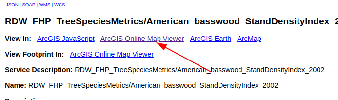
Clicking this link will then open a map in a new tab. The map will open to show the entire range for this species across the continental U.S., so you may have to zoom in a bit to get to your area. But once you’ve zoomed in, you’ll be able to explore in fine detail the approximate density of that species of tree.
Things to Keep in Mind When Using This Dataset
Like I mentioned earlier, the data values you see on the map represent the approximate density of that species in trees per acre. This dataset uses a black and white color scale to represent the values, where white signal represents a higher density than black signal.
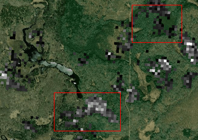
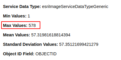
Here’s an important thing to keep in mind about this scale: the value that the white signal represents (the highest value), is different for each tree species. Furthermore, it represents the highest value found in the entire dataset for that tree. So if you’re viewing a species of tree that doesn’t ever achieve great density, then the color of the signal might make it seem like that tree has a greater density than reality.
Secondly, it’s always important to remember that these maps are more than 20 years old. So anything that has happened since 2002, such as logging, forest fires, or tornado damage, will not be represented by this dataset. Generally speaking, satellite imagery is your friend here, as you can use it to quickly check whether the forest appears to still be in good condition.
Finally, my experience has been that this granular dataset is generally more accurate with a popular species of tree. There just usually isn’t a ton of reliable signal for the lesser known species, so I would keep that in mind if you’re looking for less common trees.
The Individual Tree Species Parameter Maps Dataset
The next dataset is the Individual Tree Species Parameter Maps, which has a handy map interface for everything that you can bookmark. It has many similarities to the other dataset, but using it is a slightly different experience.
What This Dataset Offers
One of the biggest distinctions between this dataset and the other is that more metrics are available for each tree species. In addition to the Stand Density Index and Basal Area metrics, this dataset also has the following metrics available to individual species:
- Frequency
- Percent Basal Area
- Quadratic Mean Diameter
I haven’t been able to find explicit definitions for each of these metrics, but here’s my best guess as to what everything represents.
The Frequency metric is measured on a scale of 0 to 100, and seems to indicate the percentage of trees in a woodlot that are represented by that given species. I’m entirely speculating here, but I would assume it’s possible that this represents a population count of total species, and does not account for individual tree size.
Percent Basal Area would then be a slightly different metric than frequency. It also is measured on a scale of 0 to 100, and it should represent the percentage of a woodlots total basal area that is represented by that species. It’s worth noting that basal area is a density measurement that takes into account tree size because it is trying to measure volume, not population.
The Quadratic Mean Diameter is a metric that has an official definition on wikipedia, so we can work off of that. The QMD metric is an effort to represent the average diameter of a tree in a woodlot, but it emphasizes larger trees, so it will always be larger than the strict average. The map shows the QMD on a scale of 0 to 20, where I can assume the USFS is using a unit of inches.
While this dataset offers interesting metrics that can be used in many creative ways, there is one giant caveat: the resolution of this dataset is much less precise when compared to the other one. In fact, with a resolution of 240-meters, each pixel from this dataset contains 64 pixels from the other dataset. So we’re going to lose a lot of precision when we use this dataset, but that’s OK, because the additional metrics make it worthwhile.
How to Load a Map With This Dataset
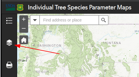
When compared to the other dataset, this dataset has all of the trees together in a single interface, so you don’t have to navigate a bunch of different links. To find this list of trees, go to the pane on the left and click the ‘Layer List’ button, which is the icon with the three stacked squares. Second, you’ll note that the trees from the same genus/family(?) are grouped together. So if you want to add the ‘white ash’ species to the map, you’ll first need to expand the ‘Ash’ layer group.
Here’s the slightly tricky part about adding trees to the map with this tool: a layer will only be visible on the screen if the entire chain of check-boxes are checked. For example, say you want to load the Quadratic Mean Diameter layer for the ‘white ash’ species onto the map. In order to do this, you’ll need to ensure that each of the following check-boxes must be checked:
- Ash - for the layer group
- white ash - for the species
- Quadratic Mean Diameter - the metric you want to show

Only once all three of those boxes are checked will the data load on the screen. This setup does make sense logically, it just takes a little getting used to.
Take note that you can load multiple datasets onto the map with this tool. I suppose there could be valuable reasons to do this, but I find that it tends to clutter the screen and it’s hard to make sense out of what is what. Also, note that if you ever want to check which layers are loaded you can click the first icon that looks like the bulleted list with three items. This contains the Legend for the map, and it will only show layers that are visible.
Generally speaking, there are more bells and whistles available for this tool when compared to the other dataset, but I haven’t found them to be terribly useful.
Things to Keep in Mind When Using This Dataset
The biggest thing to keep in mind while using this dataset is that the resolution is much larger than the older 2002 dataset. This isn’t necessarily a bad thing, it just means that the 240-meter resolution can’t give you the precise shapes you might expect when coming over from the 30-meter dataset.
I’ve also noticed that the tool for viewing the tree layers for this dataset is sometimes a bit clunky. I’m not entirely sure why it can be slow, as I’m working on a desktop with a fast connection, but I do experience significant lag from time to time.
Without a doubt, my favorite part about this dataset is the additional metrics they make available. Whereas the 2002 dataset is allowing us to only measure the volume of a tree species for that woodlot, here we can ask much more interesting questions. These questions can be extremely relevant for anyone that spends time in the outdoors, as they help us determine the characteristics of the woods before we step foot in them.

For example, I’m based in northeastern Wisconsin and spend a decent amount of time in two different areas of public lands: the western shore of Green Bay and the Nicolet National Forest. Just from my experience on the ground I could tell you that the forests of the former are much younger than the forests of the latter. And this is corroborated when I pull up the QMD layer for the white ash species. The vast majority of the signal on the shore of the Green Bay is green (indicating smaller tree size), while the Nicolet National Forest signal has much more orange and red signal (indicating more mature trees).

The last thing to note is that this dataset is much more recent than the 2002 dataset. I believe this data is from around 2015, but I’ll have to dig around to confirm whether this is the case.
Wrapping Things Up
While I know that this post was heavy on the theory, I think it’s important to take a bit of time to understand the basics about these datasets. And even though I know that this data is mostly used by the scientific community, I think the general public could benefit greatly from it.
I do recognize that these tools are a little inconvenient to work with, especially if you decide that you want to download the data and use it for your own purposes. I do have a lot of experience working with this data, and I’m contemplating some browser extensions that could make these tools that much more accessible for the average person. More to come on that later.
Lastly, I’d like to thank you for your time and attention if you managed to get through this entire novel of a post. I hope you found the material interesting and can understand why I’m so passionate about spreading the word about this data and making it more accessible for my fellow outdoorsy people.